
Color accuracy is an unheralded art form in the printing industry. Printers can go to great lengths to guarantee their clients are getting as close to the shade they requested as possible. It’s no small feat considering the number of possible ink permutations. The customer is nevertheless always right.
As such, even if it often gets overlooked as a key component of the printing process, inspecting color remains critical to the success of a given job. Here are five best practices printers take into consideration to ensure that success:
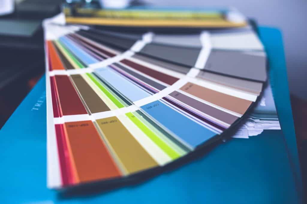
Keeping Pantone Swatch Books Updated
During the brainstorming/ design phase, companies look through their in-house Pantone swatch books to determine which color fits best in the artwork they’re having printed. Different books exist for different types, like solids, metallics, pastels, and neons.
From there, the designer enters specific Pantone Matching System values into the PDF as a reference for the printers, so they know which shade to use. It’s important to make that distinction as simply designing with a color isn’t enough. Colors aren’t accurate on PDFs and won’t necessarily correspond to the desired Pantone one.
Approximations are far from ideal as customers trust the printers to give them exactly what they want. With that in mind, the books need to be regularly updated as colors fade over time. This is important not just for selecting a color at first, but also when the proof comes back from the printer and the color must be checked. In effect, in a perfect world, everyone in the workflow is working off the latest version of the same book.
Much like the printer will do before sending off the proof, the customer will hold up their Pantone book beside the hard copy and compare the two. It’s not a perfect science, but, if a digital solution isn’t available, it does the trick, albeit with less accuracy and in more time.
CMYK vs. Pantone
The CMYK color space is used instead of RGB by printers. RGB (red, green, and blue) is created with light; CMYK (cyan, magenta, yellow, and black) is created with ink that absorbs the different light waves, effectively displaying what remains. However, when it comes to CMYK vs. Pantone, the answer as to why printers prefer the former is more complex.
Utilizing the CMYK color space involves printing with four plates, one on top of the other. Each is made up of different tones of one color so that, when it’s combined with the other three, many result. When a customer requests a Pantone value, ink has to be specially mixed. So, put simply, Pantone printing is costlier, especially when more than one color has been requested for a job, especially when it doesn’t pay off as much to prep the press if that job is small.
That isn’t to say printing Pantone colors is impossible. A close CMYK conversion is simply the path of least resistance where, if the customer is not dead set on a specific Pantone shade, it might be the best option available.
Providing a Drawdown Proof
Colors don’t appear the same on different surfaces or substrates. Adjustments are unavoidable. So, in addition to a hard copy, printers will also provide customers with a drawdown proof upon request. The drawdown is essentially a sample of the ink without the artwork, but on the actual substrate on which it will ultimately appear. As such, the drawdown proof is an indispensable tool that alleviates customer concerns.
Using a Spectrophotometer
A spectrophotometer is a device that checks the color bar, the strip of colors across one side of the press sheet. Spectrophotometers ensure color consistency the length of a job. Inline (on the press) and handheld incarnations exist, but, whichever type, they have become industry staples.
Ideally, instead of checking the color bar, which doesn’t even make it into customer’s hands, the artwork’s color accuracy would be verified instead. As a result, handhelds, which can be picked up and placed at different positions, have their benefits. By the same token, in the event of repeats, it’s unrealistic to inspect the same exact point at each position to be measured if it’s continually lifted up and placed back down. That’s where a digital solution, which could bookmark points to be automatically inspected on loaded repeats, might be advantageous.
Spectrophotometers nevertheless won’t be replaced. Using each to complement one another gives printers the best of both worlds, though: The convenience of a digital solution to check the color of entire jobs in a fraction of the time and the accuracy of a spectrophotometer, which can double-check potential differences when something is detected as being amiss.
Providing Confirmation of Color Inspection
One arguable limitation of spectrophotometers is the lack of a generated report of its findings. Printers are forced to give verbal or written confirmation, leaving customers to have to take them at their word or delay going to market by spending time manually checking the color themselves.
In contrast, a report, which a digital solution would generate, gives customers proof all color points were verified. It wouldn’t simply provide confirmation, but also the individual CMYK, LAB, RGB, and Pantone values at each point, leaving the customer justified in going straight to production.
A report would improve communication between the printer and customer. Not only would the customer receive certification as to the accuracy of the color, but the level of trust between the two parties would arguably improve. The customer would at least trust the process to a greater degree as there would no longer be a gap in the workflow.
As long as the customer is satisfied with the end result, they’re likely to continue to do business with the same printer moving. That not only means a satisfied customer, but more business for the printer. That’s the undeniably optimal outcome of following the above best practices.