Graphic Design: 5 Tips for Choosing Colors
Choosing a color scheme for any logo, flyer, poster, pamphlet or brochure can be difficult, especially if you have no experience in graphic design. However, if you have the right knowledge and know how to use the tools available to you, finding the perfect eye-catching color palette will become much easier.
In this post, we will introduce the basics of color theory and share our best tips for choosing a color scheme.
Crash Course in Color Theory
Think back to elementary school, or even high school. Did you ever make a color wheel out of paper plates and acrylic paint? If that was the case, you learned basic color theory. If this doesn’t sound familiar here is a refresher course.
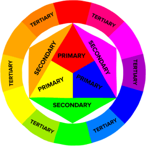
Color theory is not very complicated if you understand the three type of colors: Primary, Secondary, and Tertiary.

Primary Colors
Red, yellow and blue are the primary colors that serve as the building blocks for every other color.
Secondary Colors
Secondary colors are achieved by mixing two specific primary colors. There are three secondary colors: purple, green and orange. Here’s how to create these:
| Red + Blue = Purple |
| Blue + Yellow = Green |
| Yellow + Red = Orange |
Tertiary Colors
To create tertiary colors, you can mix secondary colors with primary colors. However, not every primary color mixes well with every secondary color. If they are not compatible, the result will be a brown color.
A trick to remembering the correct combinations is by only mixing colors that come next to each other on the color wheel, but here’s a list to help:
| Red + Purple = Red-purple (magenta) | Red + Orange = Red-orange (vermillion) |
| Blue + Purple = Blue-purple (violet) | Blue + Green = Blue-green (teal) |
| Yellow + Orange = Yellow-orange (amber) | Yellow + Green = Yellow-green (chartreuse) |
Now that you understand the basics of color theory, it is time to apply this knowledge to designing your project.
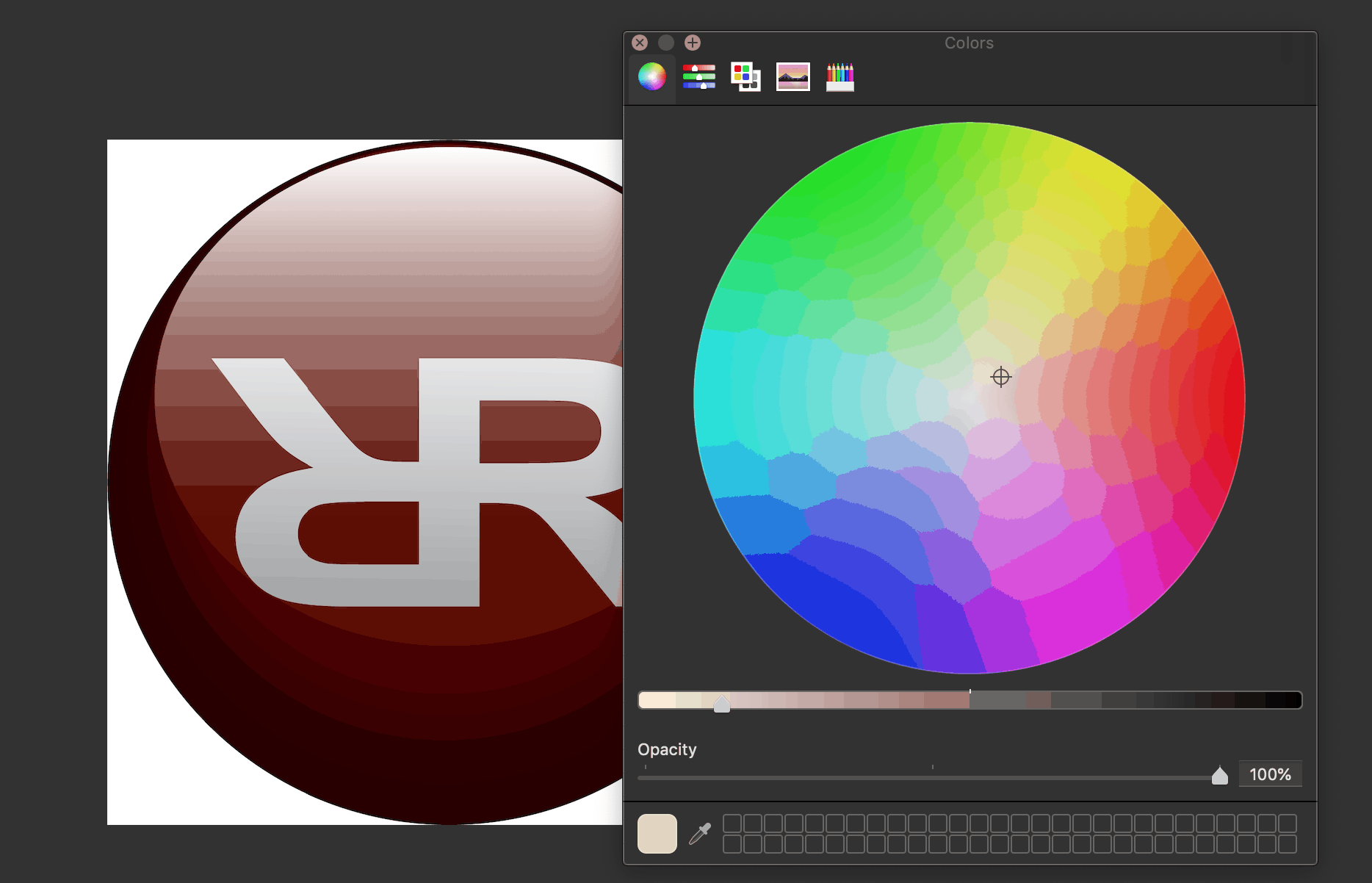
When you go to choose a color on any graphic design software, you will have the option to choose a preset color or “create” your own. If you choose the latter, you will be confronted by a color wheel and an intimidating set of numbers. This is because digitally, color is described differently than in the physical world.
All computers use the RGB color model, and all printers use the CMYK color model. Before you begin choosing colors, you should understand what these acronyms mean and their scales.
Color Models in Graphic Design
RGB
RGB stands for Red, Green, and Blue. RGB is the color model used by electronic displays and is an additive model, meaning to get white you combine all the colors. The RGB scale is 0 to 255. In RGB black is R=0, B=0 and G=0, and white is R=255, B=255, and G=255.
CMYK
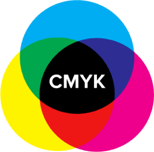
CMYK stands for Cyan, Magenta, Yellow, and Key (black). It is a subtractive color model meaning you have to subtract color to get white, and conversely, by adding more colors, you get black.
An easy trick to remember this is by thinking about how a printer works. Often you are printing on white paper, adding color blocking the white paper from coming through. You can also remember by looking at the CMYK scale. It ranges from 0 to 100. When C=100, M=100, Y=100 and K=100 you get a black color. When the opposite is true, C=0, M=0, Y=0, and K=0, the result is true white.


For a more in-depth explanation of the two color models take a look at our past blog post on the subject: Why Do Printers Use CMYK?
Choosing a Color Scheme
Now with some baseline knowledge of color theory here are 5 quick tips for choosing a color scheme.
1. Know your color context.
Our perception of color changes depending on how they contrast with other colors. When choosing a color scheme have a solid idea of how much contrast you want there to be between colors in your scheme.
Choosing colors with high contrast is pretty straightforward, but finding colors that go well together can be a time-consuming process, luckily there are tools that help speed things up. Which brings us to our next tip.
2. Use a color wheel.
Even graphic design professionals use a color wheel. Do not be afraid to use it to help you find both analogous and complementary colors schemes.
Create an analogous color scheme by choosing one main color and pairing it with the two adjacent colors. If you want a five-color scheme use the colors adjacent to the two secondary colors. Analogous color schemes are low contrast but perfect if you are looking for a softer look for your graphic design.
To create a complementary color scheme choose two colors on opposite sides of the color wheel using lighter variations of each as accents. Complimentary color schemes are high contrast which can be risky , so we recommend choosing one main color using the second color for accents.
3. Focus on a single color.
Monochromatic color schemes are simple yet elegant. They lend a clean and fresh look to any graphic design. While they lack contrast, monochromatic color schemes can be the perfect choice for a bright and attention-grabbing flyer, brochure, or business card.
4. Try multiple color schemes.
You shouldn’t feel limited to only the color schemes mentioned. There are several other options like triadic color schemes or split complementary schemes. Each color scheme has its own advantages, don’t hesitate to play around with them. Explore the endless possibilities and you will get better at graphic design.
5. Don’t stop exploring!
While preset color schemes are helpful when just starting out, do not feel anchored to using them. Use the information in this blog post to create your own schemes and save them. A good place to start building color schemes is by choosing one color and building from that. If you introduce too many colors at once, it can be hard to find ways to make them work together.
Choosing the perfect color scheme for any graphic design can be a time-consuming process but it can also be fun if you are using the right tools and have the right resources. There is no greater feeling than finally finding the perfect colors that make your design stand out and look great. Good luck!


