Graphic Design Do’s and Don’ts for Printing
Ever stared at a graphic design do’s and don’ts for printing, wondering how the pros make it look so easy? You’re not alone. The world of print design can be as thrilling as sailing through an archipelago of creative islands, yet equally daunting when you hit those choppy waters.
A pinch of color here, a sprinkle of font there – like culinary artists, we blend elements together hoping to create that Michelin star-worthy piece. But what if I told you that perfecting your printed designs doesn’t need to feel like whipping up a five-course meal?
we send them off to print. By understanding these elements, you’ll have the tools needed for perfect prints every time. You’ll see how bleed and safety margins can prevent those annoying cut-offs, why picking the right file types matters so much, and what role high-res images play in achieving crisp results. We’ll also touch on using white space effectively – it’s more important than you might think! Finally, we will talk about structuring your files correctly before sending them out for printing – because a well-structured file is like a well-oiled machine; it just works better!
Table of Contents:
- Understanding Graphic Design Do’s and Don’ts for Printing
- Importance of File Types and Image Resolution in Print Design
- Utilizing White Space and Spot Colors in Print Designs
- Choosing the Right Colors and Fonts for Print Design
- Ensuring Print Readiness and Proper Structure in Design Files
- Incorporating Branding and Logo Design in Print Projects
- Enhancing Print Designs with High-Quality Stock Images
- FAQs in Relation to Graphic Design Do’s and Don’ts for Printing.
- Conclusion
Understanding Graphic Design Do’s and Don’ts for Printing
When it comes to creating an effective graphic design, the devil is in the details. With years of experience, we at Replica Printing Services have seen how even small oversights can make or break a print project.
The Role of Bleed and Safety Margins in Print Design
In printing lingo, ‘bleed’ refers to graphics that extend beyond the edge of your document. It ensures that no unprinted edges occur when your document is trimmed down to its final size. On the other hand, safety margins are critical areas inside your design which prevent vital information from being cut off during trimming.
Avoid having parts of your print designs accidentally chopped off by paying attention to bleed and safety margins. Make sure important elements like text and logos stay within these boundaries.
Importance of Spell Checking in Graphic Design
We’ve all had our moments with typos; they’re almost unavoidable. But spell checking isn’t just about avoiding embarrassing mistakes—it’s also about presenting yourself as detail-oriented professional.
If you’re designing materials for a client, any spelling errors could harm their brand image or confuse customers—neither scenario ideal. Double-check everything before sending it off for printing; this simple step will save you potential embarrassment later on.
Trends: Embrace Them Or Not?
Beyond basic rules, another aspect worth considering is current graphic design trends. Whether you choose to embrace them or forge your own path, being aware of trends can give you fresh ideas and keep your designs relevant. However, remember to prioritize the brand’s identity over fleeting design fads.
Graphic design is an art with its own rules and principles. By following these do’s and don’ts—and learning from others’ mistakes—you have a shot at making your client’s brand shine. After all, isn’t that what good graphic designers aim for?
Key Takeaway: Graphic design for print is all about the details. Keep an eye on bleed and safety margins to prevent your designs from being unintentionally trimmed off. Don’t underestimate the importance of spell checking, it reflects your professionalism. Stay aware of current trends but remember, brand identity should always come first.
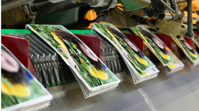
Importance of File Types and Image Resolution in Print Design
In the world of print design, paying attention to file types and image resolution is crucial. Not all digital files are the same, particularly when it comes to creating printed products of high quality.
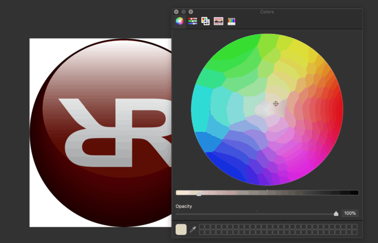
RGB vs CMYK – Choosing Correct Color Models for Print Designs
To ensure accurate color representation from screen to paper, you need to understand RGB and CMYK color models. While RGB (Red-Green-Blue) is used for digital platforms like web design due its broad spectrum of colors, it doesn’t translate well onto actual paper.
This is where CMYK (Cyan-Magenta-Yellow-Key), a four-color model specifically designed for offset printing steps in. The way these colors mix gives us a more limited range but one that’s accurately reproducible on printed materials.
Selecting Appropriate File Types
When preparing your design files for print projects, choosing the right format can make or break your final product quality. For instance JPEG images may be great for quick previews but they lose data each time they’re saved which affects their clarity over time.
PDF files are typically preferred by printers because they preserve fonts and layout settings across different devices ensuring what you see on screen matches with what gets printed.
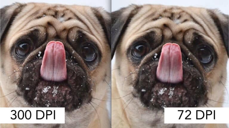
Maintaining High Image Resolution
A common pitfall among novice designers lies in using low-resolution images expecting them not to impact their finished product – a serious miscalculation. A rule-of-thumb worth remembering: if an image looks blurry on your screen sizes at 100%, then expect it to print blurry too.
To ensure sharp visuals in your design projects, use high-res images with a resolution of 300dpi. Remember: image resolution should ideally be 300dpi (dots per inch) for print designs.
Conclusion
Keeping these tips in mind can save you from costly and time-consuming reprinting caused by poor file choice or low image resolution. But remember, while tools are important, the heart of good design lies within creativity – so go ahead and let your unique creative flair shine through.
Key Takeaway: File types and color models are crucial in print design. For the best quality prints, select the correct file format, such as PDF, which maintains fonts and layout configurations. Make sure to use CMYK for precise color display on paper. It’s also important to use high-resolution images – 300dpi is ideal – so your prints aren’t blurry. But remember, despite these technical aspects, your unique creativity remains at the heart of any successful design.
Utilizing White Space and Spot Colors in Print Designs
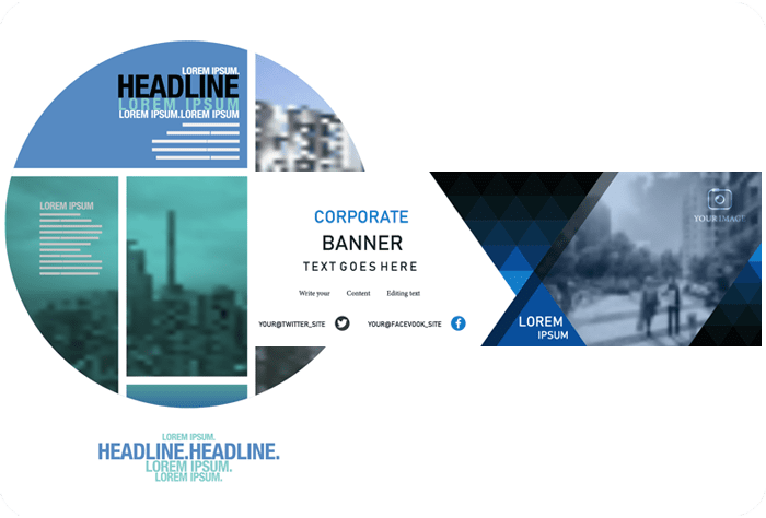
The charm of graphic design frequently lies not only in what is visible, but also in that which isn’t. That’s where white space or negative space comes into play. It is the area between elements that gives your eyes a break, helping to highlight key components within your print designs.
Used effectively, white space can make designs appear cleaner and more professional. When it comes to spot colors – those specific shades outside of the standard CMYK color model – they can enhance visual appeal by adding vibrancy and uniqueness.
The Power of Negative Space in Graphic Design
Negative space isn’t about leaving areas empty; instead, it’s about strategic use for better readability and structure. By allowing each element its own territory on the page layout document, you let them breathe while giving viewers’ eyes room to rest. This leads to an overall pleasing aesthetic experience that keeps readers engaged with your design work longer.
A study found that complementary colors should be used together while mismatched colors can hurt the viewer’s eyes and affect the design’s message.
Much like using silence as a note in music composition, smart usage of white space could turn out as one of your greatest allies when striving for good design principles.
Finding Harmony with Spot Colors
If white spaces are like pauses enhancing rhythm within compositions, then spot colors are soloists drawing attention towards themselves during their performance moment. They stand out from typical CMYK combinations due to their unique creative potential limited only by the designer’s imagination.
But remember, using spot colors can be like playing with fire. If done correctly, your design will stand out from the rest; if not, it could be a total failure. It’s essential to double-check and ensure the color is accurate on actual paper as screen sizes and settings may alter how they appear.
A Fine Balance Between White Space and Spot Colors
But once you master this balance, it’s like learning a new dance. The rhythm between white space and vibrant spot colors in your print designs becomes second nature, turning the tricky into the terrific.
Key Takeaway: White space isn’t just emptiness in your design – it’s a powerful tool to highlight key elements and improve readability. Similarly, spot colors can add unique vibrancy if used correctly. However, striking the right balance between white space and spot colors is crucial for creating visually appealing print designs that stand out without overwhelming the viewer.
Choosing the Right Colors and Fonts for Print Design
Selecting colors that pop on print is an art in itself. With a seemingly endless range of colors to choose from, it can be overwhelming deciding which ones will make your print design stand out. But hold your horses. The first step is understanding how bright colors behave differently when printed.
Bright reds, blues or greens may look stunning on digital platforms but could appear dull when printed due to the difference between RGB (screen) and CMYK (print) color models. This means it’s essential to double check your design with both screen sizes and actual paper samples before committing.
Finding Harmony Between Colors Bright & Dark
The secret sauce lies in using contrasting shades – pairing bright colors with darker ones creates an eye-catching balance while also ensuring legibility. Remember, good design isn’t just about looking pretty; it needs to communicate effectively too.
Consider this: cyan magenta can give off different vibes depending on their surrounding hues. When paired correctly they bring out each other’s vibrancy making your printed design stand out even more.
Fun with Fonts – Enhancing Legibility and Brand Consistency
Moving onto fonts now. Your choice of font size plays a significant role not only in readability but also shaping brand identity. It’s crucial then, that you pay attention during the entire design process – especially if there are multiple elements involved such as logos or page layout documents which need specific font styles for consistency.
“Selecting the correct font for the job increases the design’s efficacy by 58%.”
For instance, while Comic Sans may bring back fond memories of the 90s, it’s probably not a good fit for most professional designs. And please don’t get us started on using too many fonts – it can quickly disorient your audience and dilute brand consistency.
In conclusion, whether you’re working on logo design or an entire branding project, keeping these color print and font tips in mind will make sure your work is both visually stunning and effectively communicative. Remember to keep experimenting with different combinations until you find what makes your brand shine.
Key Takeaway: Print design magic lies in color and font choices. Understanding how bright colors behave differently on print versus digital is key, so double-check designs on both platforms before finalizing. Create eye-catching balance with contrasting shades and remember good design communicates effectively. Font selection shapes brand identity – choose wisely for readability and consistency throughout your work. Keep experimenting until you find the perfect blend that truly captures your message.
Ensuring Print Readiness and Proper Structure in Design Files
Making sure your designs are print-ready is like setting the table before a feast. It helps to avoid nasty surprises, saving you both time and money. The key elements here are structure and attention to detail.
Leveraging Grids for Structured Designs
Think of grids as invisible guides that help align all elements in your design piece – similar to neatly organizing dishes on a dining table. They ensure consistency across pages, giving your printed work an organized look. Grid systems can also give you more control over where each component sits within the entire layout.
The use of grids can drastically improve how well structured a design is when it’s translated into print form. You don’t want some text awkwardly floating around like uninvited guests at dinner. Grids bring everything together harmoniously.
Borders too play an essential role; they act as safety buffers preventing any vital parts of your artwork from being lost during the trimming or binding process – think about them as place mats protecting against accidental spills.
To ensure accuracy, always double-check measurements before sending files off for printing; after all, nobody likes uneven margins ruining their beautifully designed printed materials – imagine serving soup with more salt than needed. This practice will prevent skewing if cutting is slightly off by just 1-2 millimeters, which often happens during mass production runs at Replica Printing Services.
Incorporating Branding and Logo Design in Print Projects
Branding is a powerful tool. It’s not just about sticking the logo on every printed item, but rather making it an indispensable part of the design procedure. Your client’s brand should be visible and recognizable in every piece of printed material.
A well-placed business card or flyer with consistent branding can make a lasting impression on potential customers. To create that effect, we at Replica Printing Services always ensure to incorporate your business logo design effectively into each project.
Making Your Client’s Brand Shine Through Effective Logo Use
The power of logos cannot be underestimated when creating print designs. A good logo has the ability to tell a story about your company without any words involved – but how do you make sure this narrative comes through clearly?
The first step is making sure the colors are accurate for both digital platforms and physical prints. An inaccurate color could mean communicating an entirely different message than intended. Therefore, double-check all elements before sending them off for printing.
Beyond getting the color right, size matters too – particularly when working with different screen sizes and paper types used for printing various items like brochures or banners. Here at Replica Printing Services, our team pays close attention to these details so that no matter where your logo ends up – whether it’s a large billboard or small business card – its impact remains strong.
Enhancing Print Designs with High-Quality Stock Images
The use of high-quality stock images is a pivotal aspect in the realm of print design. Not only do they lend visual appeal to your projects, but also bring about a unique creative flair.
Let’s talk about image definition for starters. A blurry or pixelated image can be off-putting and detract from your design work. So always double check that you’re using high quality images in your designs. Replica Printing Services recommends using images with at least 300 DPI (dots per inch) resolution to ensure an accurate color representation on actual paper prints.
The Impact of Stock Images on Brand Perception
Incorporating stock photos helps make your brand shine amidst competition. However, pay attention to the type of images you choose as they directly reflect on your brand’s persona.
If there’s something we’ve gained insight on while working with Replica Printing Services, it’s that the ideal image not only enhances the visual appeal but also helps to communicate a narrative which text alone can’t fully convey. The right photo doesn’t just add aesthetic value; it narrates a story and amplifies the message that text alone cannot convey fully.
Avoiding Common Mistakes While Using Stock Photos
Now comes an essential part – how not to use stock photos. Avoid clichéd and overly used photos – instead opt for fresh perspectives which align better with what you want to communicate through your printed design project.
- Avoid stretching or distorting pictures beyond their original proportions.
- Stay away from low-resolution files when aiming to print large materials like banners or posters.
- Last but not least, never ignore copyright laws while using stock images. Ensure that the correct permit is acquired to utilize an image in your design job.
Striking Balance Between Stock Photos and Original Graphics
Creating a successful design requires combining stock photos with other elements such as typography, colors, and shapes to create an aesthetically pleasing product.
In our experience at Replica Printing Services, we’ve found that blending original graphics (like logo designs) with appropriate stock images can give your prints an edge over those relying solely on either one.
Key Takeaway: Stock Photo Savvy: To boost your print designs, use high-quality stock images with care. Keep them clear and crisp (aim for 300 DPI), choose ones that reflect your brand’s story, avoid clichés or distortions, respect copyright laws, and blend well with original graphics.
FAQs in Relation to Graphic Design Do’s and Don’ts for Printing.
How do I prepare my graphic design for printing?
To prep your designs, choose high-res images and the right file types. Make sure to use CMYK color models, ensure spell-checking, set proper bleed margins, and create print-ready structures.
What should graphic designers know about printing?
Graphic designers need to understand the importance of choosing correct file types, image resolution, colors (RGB or CMYK), font selection for legibility and brand consistency. They also must be aware of safety margins and proofreading before finalizing their designs.
What are the 7 rules of graphic design?
The seven rules include alignment for a clean look; contrast to make elements pop; repetition for uniformity; proximity grouping related items together; balance in element placement; hierarchy showing information importance levels; space utilization – both positive & negative.
What are the 5 common mistakes graphic designers make?
Mistakes often made by designers include ignoring white space usage, poor choice in fonts or colors that don’t align with branding guidelines. Additionally, overcomplicating designs or not checking work thoroughly before sending it off can lead to costly reprints.
Conclusion
So, you’ve sailed through the ins and outs of graphic design do’s and don’ts for printing. From understanding bleed and safety margins to picking out the right file types – you’re now equipped with knowledge that was once hidden.
You learned about the power of white space in graphic design. You discovered how it can make your designs look cleaner, more professional. Remember: simplicity is key!
We also touched on colors and fonts – crucial elements that breathe life into our creations. Never underestimate their impact! Use them wisely to enhance brand identity and readability.
Last but not least, we talked about structure – because good structure equals a smooth print process. Keep those files tidy!
Now go forth! Harness these insights, unleash your creativity, elevate your designs for print.